

When I created OpenDithering back in June, the feature I was proudest of was the Auto-tune button. It did the slider work for me: it compared the dithered result to the original image, nudged the settings, and repeated until the image stopped improving. Over the summer it grew into a three-step process (Auto Expose, Color-tune, and Hue-tune), each one fixing a different way the dithered image drifted.
This weekend I deleted all of it.
What replaced it is an algorithm from 1992 that I had never heard of until recently: Direct Binary Search, or DBS. It’s slow, it’s a little obsessive, and it’s the biggest jump in image quality I’ve seen while experimenting with OpenDithering.
What auto-tune was really doing
To explain why, I first have to admit what Auto-tune actually was: a bandage. Every algorithm in OpenDithering, from Floyd-Steinberg to Dizzy, is some form of error diffusion. Each one visits every pixel once, picks the nearest ink color, and pushes the leftover difference to neighbors it hasn’t visited yet. Then it moves on and never looks back. It’s fast, and it works surprisingly well, but it makes every decision with only half the picture. A pixel can’t know that the choice it just made will look odd next to what ends up beside it later.
One known visible result is that colors come out comparatively muted after dithering. Auto-tune compensated for that by turning up saturation, color gains, and contrast before dithering, so that what came out the other end looked closer to the original. It worked! But it was treating the symptom, not the cause. And the more it compensated, the more it depended on the dithering algorithm continuing to lose the exact same amount of color it had compensated for.
Direct Binary Search: dithering that looks back
DBS comes from halftoning research: the science of building up tones from patterns of dots, studied mostly for printers with limited colors ink available. Dithering for screens with limited colors is really the same problem, just specifically aimed at computers. Even though it was originally derived for print, it turns out DBS translates perfectly to e-paper. It was published by Analoui and Allebach in 1992, and extended to color by Agar and Allebach in 2005. The idea is simple to explain, and very expensive to run:
- Start with an already dithered image (OpenDithering already does that very well).
- For every pixel, try changing it to every other ink, and try swapping it with each of its eight neighbors.
- For each option, ask: does the image now look more like the original to a human eye? If yes, keep the best change.
- Repeat for the entire image, pass after pass, until a full pass finds nothing left to improve.
Where error diffusion makes one decision per pixel and moves on, DBS keeps going back to second-guess itself. Remember Seurat and his pointillism from my previous post? Error diffusion is painting the dots in one go, from the top left to the bottom right. DBS is Seurat stepping back from the canvas, squinting, and going back in to fix the dots that don’t work. Thousands of times.
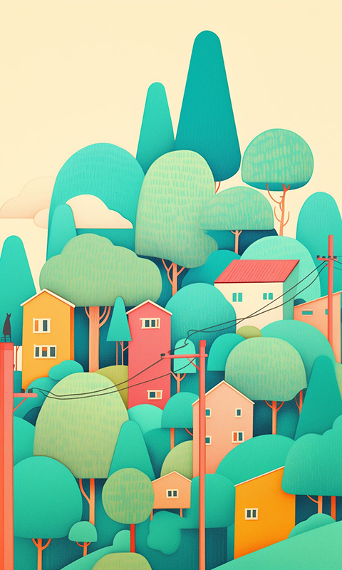
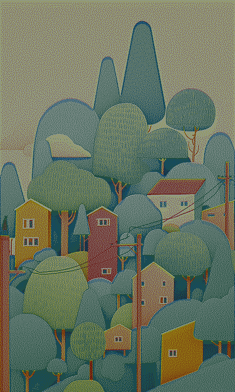
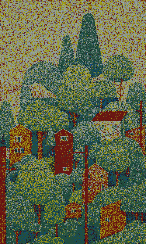
Modeling the eye
That “does it look more like the original to a human eye” question is doing a lot of work. You can’t just compare pixels one by one: a dithered image is supposed to be wrong on every pixel but right when they’re all seen on average. So DBS needs a model of how your eye blends those dots together.
OpenDithering uses the eye model from the DBS research: a blur that mimics how much detail your eye can pick up. Two things make it interesting:
- Your eye sees brightness detail much more sharply than color detail. So the model uses a narrow blur for lightness and a wider blur for color. A slightly wrong color in one dot gets hidden; a slightly wrong brightness is much more visible.
- How much your eye blends depends on how far away you are and how small the pixels are. That’s why there are two new sliders: Viewing distance and Panel PPI (pixels per inch). For most device presets, the PPI is filled in automatically from the screen size. The viewing distance is up to you: how far from your frame do you usually stand?
The big difference this approach made for me? My colors were finally in the right ballpark. Even in the first experiments with DBS, I was amazed how much richer the colors appeared when compared to traditional dithering algorithms, even if I pushed the saturation and contrast sliders to help the dither. Because DBS keeps comparing how the modeled eye sees the modified result to the original image, the colors keep getting closer with every pass. That discrepancy between the original colors and the dithered ones was why I had first built color and hue tuners: to get those rich colors back in a way that still felt organic. But after 10 passes of DBS, they were closer than the tuners ever got.
Too slow for a live preview
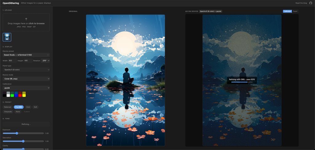
All that searching comes at a cost. Error diffusion finishes in milliseconds, so OpenDithering re-dithers live as you move a slider. DBS takes seconds to minutes depending on the size of your display. That’s why it’s not in the dithering algorithm dropdown, but a separate Refine (DBS) button: you set up your image with the regular algorithms first, then refine the result.
It runs in the background with a progress overlay on the preview, so you can still zoom and pan while it works, and you can cancel it at any time. A Passes slider limits how many rounds it gets; in practice most of the improvement happens in the first few passes.
The new Auto Tune
So, confronted with this superior way to refine the image, I deleted all the old tuners I had worked on and hooked up the existing button to our new functionality. Auto Tune now does two things: it applies a Pre-DBS preset, which gives neutral dithering settings for DBS to start with, and then runs DBS to refine the image for 10 passes.
The difference with the old version is fundamental. The old Auto-tune adjusted settings by trial and error, hoping the dithered version of those changes would land closer to the original. The new one doesn’t touch the settings, and instead optimizes the pixels themselves directly against what your eye will see. There’s nothing to compensate for anymore.
As a result, my recommendation from the first post has changed:
- For a 6-color Spectra 6 display, select your device preset, upload the image, and hit Auto Tune. Wait for it to finish, upload to your panel, then judge the result there. If you want more punch, add a bit of saturation or contrast and hit Refine (DBS) again. The default viewing distance should work fine for most scenarios, but you can always set the viewing distance to how far away you actually look at your frame. Increasing that will mean DBS takes (much) longer to run!
Thanks, science
The previous post ended with credits to the e-paper community, and all of those still stand. This time, I also owe a lot to a few decades of halftoning research that I am in no way qualified to read, but Claude was: Analoui & Allebach for the original DBS, Agar & Allebach for color DBS, Flohr, Kolpatzik & Allebach for the YyCxCz color space, and Kolpatzik & Bouman and Mullen for the models of the eye’s sensitivity.
My vibecoding warning still applies: I did not write this, Claude did. The most valuable thing I did wasn’t writing code, it was looking at my e-paper frames, deciding something still looked off, and feeling this deep desire to get it fixed. Most of what I removed this weekend were features I had asked for myself and Claude developed over a span of months. But it turns out the best auto-tune is the one that doesn’t actually tune anything.