One of the first vintage watches I bought was an Omega Seamaster from the ’60s, a 14759 to be exact. I found it on eBay and it had everything I wanted out of an office watch – a clean, classic model from a brand with proper heritage, with all the right details like the white dial, gold-colored alpha hands and the gold-colored applied markers. This combination in the stainless steel case looked just perfect to my eyes and I bought it without even doing any research.
I wore it very happily for a few weeks, until someone noticed that the Omega text on the dial was a bit crooked. That was odd. So when I grabbed a macro-lens to take a few close-up shots, I suddenly noticed how badly the the Omega logo was applied to the dial. It also made it excruciatingly clear that the dial was much too clean when compared to the hands.

And once you’ve seen something like that, you can’t unsee it. A badly restored dial like this is what people in the scene call a ‘redial’ – it also means that the value of the watch sinks like a brick. Most of the value of a watch is considered to live in the quality of the dial. So all in all, this was not a great purchase – I was rather new at this whole vintage watches thing.
But then I found this dial on eBay…

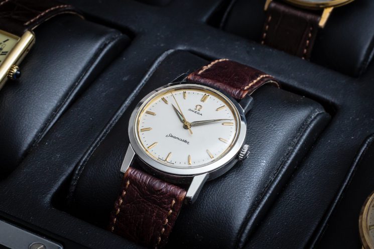
Different markers, no Seamaster text, and a crosshair on the dial – but still of much better quality than the dial that was currently in my watch. I wasn’t sure if this was going to fit, but I gambled on it anyway. I received the dial and asked my watchmaker to fit it, and…

Pretty damn good. Very satisfied with the way the watch looks now. The new markers are better-looking than those on the first dial, I don’t miss the Seamaster text, and the crosshair nicely fills out the rest of the dial. It looks even better on the wrist:

This Seamaster is definitely going to be worn more now!